Sam Parsons
@sparsonsdataviz
Biztory: biztory.com | Tableau Visionary & former Zen Master | Iron Viz '21 Global Runner-up | Views are my own
ID: 961919877454946304
http://www.reflectionsindesign.com 09-02-2018 11:09:05
6,6K Tweet
5,5K Followers
1,1K Following

Explore the use of gauge charts—also known as speedometer charts—in this #VizOfTheDay by Tableau Visionary Sam Parsons. Often used to show progress toward a target, this chart cleverly visualizes the Tableau Superstore dataset. tabsoft.co/3Y8KiaK


Thank you Tableau Public 😊


🚨 I'm hiring! 🚨 Based in: India Role: Senior Data Visualization Analyst Come work for me in my Data Viz team at Amex GBT! If you are interested, the link is below. It is critical you share your dashboard portfolio in the application. Job details: travelhrportal.wd1.myworkdayjobs.com/Jobs/job/Gurga…

Congratulations to Bo McCready and Ryan Soares for their #IronViz finalist entries! But special shout out to Kathryn McCrindle my partner in crime at Biztory before I left! Superb effort Kathryn!! Superstars all three of you!


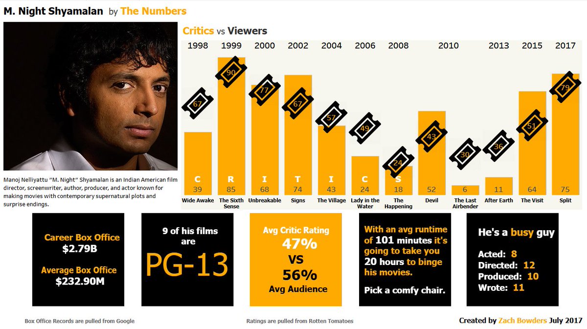
This was my first Tableau Public viz from July 2017 Since then I've published 272 vizzes, completed 5 years of the Data+Love podcast, won 2 vizzies, and have been both a Tableau Visionary and Ambassador for 5 years In the years since then I've published 272 vizzes, completed 5


Meet 2025 #IronViz finalist Kathryn McCrindle! Read Kathryn's journey to her very first Iron Viz participation and the creative approach behind her qualifier entry—taking her to compete live at Tableau Conference #TC25. tabsoft.co/3REfw4M


Here is another tip from the #DataFam community, which I learnt from Sam Parsons and is great for getting started with map layers. They are so powerful but if you turn the map off too early, you can't add more layers. #DatafamTopTip


This #VizOfTheDay created during the 2025 #IronViz competition by finalist Kathryn McCrindle explores data from wildlife strikes. Kathryn uses map layers and features line and bar charts, maps and more. tabsoft.co/3GkCvzF


This looks amazing Sam Parsons I love to see variants of the regular chart we always use and this is super brilliant.

Explore global climate data with this #VizOfTheDay by VisualClimate, who joined the Keynote stage at #TC25 and shared how she built this viz with Tableau and Agentforce for impactful insights. tabsoft.co/4cOcCo3


