Goodwright (@goodwright_) 's Twitter Profile
Goodwright

@goodwright_

Software for scientists.

By @samirelanduk and @alexharston

ID: 1144548410185388040

linkhttps://goodwright.com calendar_today28-06-2019 10:09:40

17 Tweet

171 Followers

316 Following

jaukia.bsky.social (@jaukia) 's Twitter Profile Photo

I made a small web app that creates UI designs programmatically. It randomizes design sizing, colors, typography, and some of other properties. Try it out here: uibot.app

Goodwright (@goodwright_) 's Twitter Profile Photo

We make fast, responsive websites for your lab, so you can showcase your research to the world. You can find out more here: goodwright.org

Steve Schoger (@steveschoger) 's Twitter Profile Photo

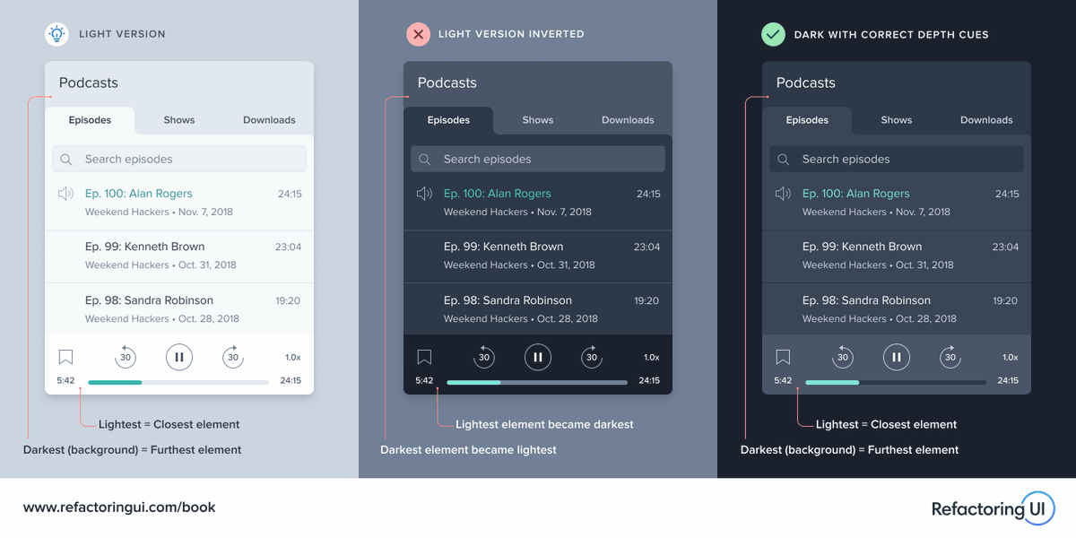
🔥 When implementing dark mode, don’t throw away the visual cues in the light version by naively inverting the color scheme. Close elements should still be lighter and distant elements should still be darker – even in a dark UI.

🔥 When implementing dark mode, don’t throw away the visual cues in the light version by naively inverting the color scheme.

Close elements should still be lighter and distant elements should still be darker – even in a dark UI.
CSS-Tricks (@css) 's Twitter Profile Photo

We don't really get :hover states on mobile. No wonder Material Designs "ripple" has become so big. Then at least you get some tap-success feedback. uxmovement.com/mobile/the-hov…

We don't really get :hover states on mobile. No wonder Material Designs "ripple" has become so big. Then at least you get some tap-success feedback.

uxmovement.com/mobile/the-hov…
Goodwright (@goodwright_) 's Twitter Profile Photo

Browsers offer much finer control over alternate stylesheets than just 'min-width'. You can have stylesheets for specific orientations, aspect ratios - and even detect the user's dark mode preference. medium.com/mabiloft/css-m…

Steve Schoger (@steveschoger) 's Twitter Profile Photo

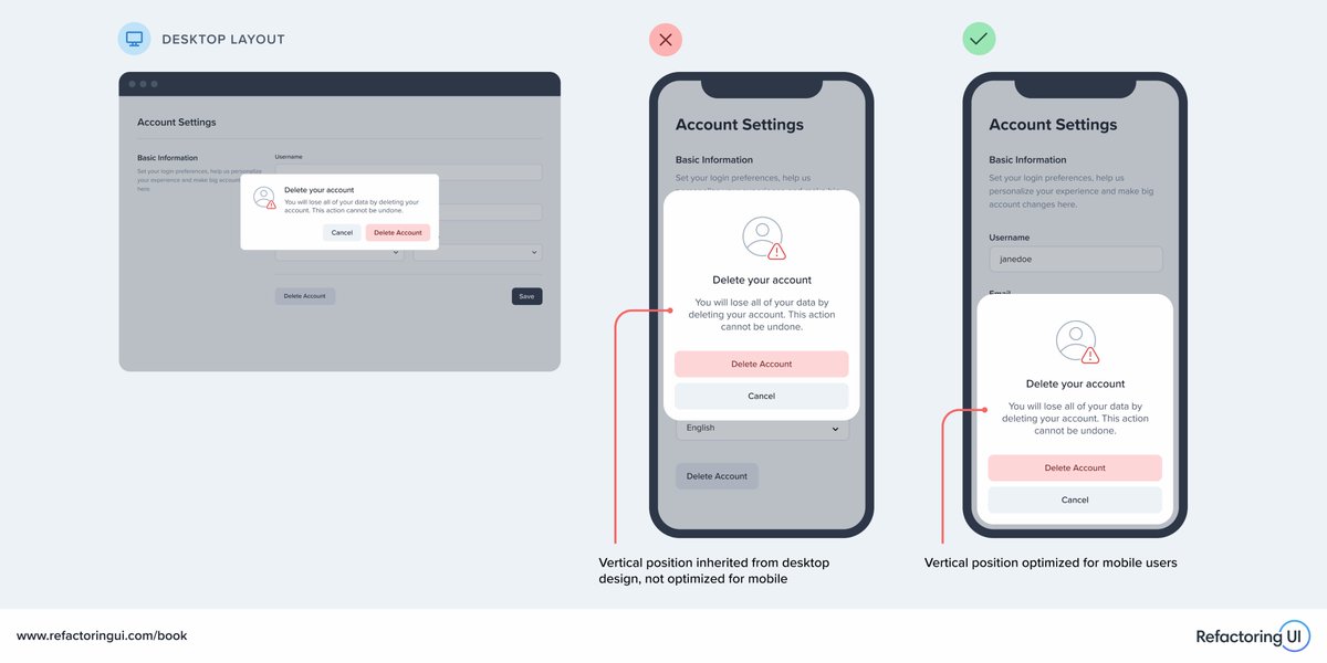
🔥 When making a design responsive, don't stop at simply making things fit on smaller screens – look for ways to borrow usability patterns from native mobile apps, too. For example, anchoring modals to the bottom of the screen instead of the center, making them easier to reach.

🔥 When making a design responsive, don't stop at simply making things fit on smaller screens – look for ways to borrow usability patterns from native mobile apps, too.

For example, anchoring modals to the bottom of the screen instead of the center, making them easier to reach.
Sam Ireland (@samirelanduk) 's Twitter Profile Photo

What does a web design/development company do between clients? Redesigns its own website of course. If you or your lab are thinking of getting a lab website, or upgrading an existing one, we’d be happy to help Goodwright. goodwright.org

Alex Harston (@alexharston) 's Twitter Profile Photo

We've just finished the rebuild of our own site, goodwright.org - if your lab needs a new website that's designed specifically for science, and dead simple to maintain, check out Goodwright

ule_lab (@ule_lab) 's Twitter Profile Photo

We would like to update everyone on the current availability of our free iMaps platform for CLIP data analysis and our exciting future plans! 1/6

ule_lab (@ule_lab) 's Twitter Profile Photo

Secondly, we are actively developing iMaps v2 with Goodwright imaps.goodwright.org - this platform will have several improvements, including a Nextflow backend based on nf-co.re/clipseq/1.0.0 3/6

Sam Ireland (@samirelanduk) 's Twitter Profile Photo

Users of our nextflow.py library - the name of the library on PyPI has changed from 'nextflow' to 'nextflowpy', as we've given the nextflow name to Nextflow itself. Otherwise, everything else remains the same, and development continues. 🚀 github.com/goodwright/nex…