Tableau Public (@tableaupublic) 's Twitter Profile
Tableau Public

@tableaupublic

Share, create, and explore @Tableau data visualizations for free on Tableau Public. For more inspiration, view our #VizOfTheDay and connect with our #DataFam ❤️

ID: 519769200

linkhttp://public.tableau.com/s/ calendar_today09-03-2012 19:52:52

5,5K Tweet

70,70K Followers

1,1K Following

Tableau Public (@tableaupublic) 's Twitter Profile Photo

This #VizOfTheDay by Veronica Simoes uses bar charts, line charts, and an interactive language switcher to explore insights on generative AI in Brazil. tabsoft.co/4jXU5HN

This #VizOfTheDay by <a href="/vsimoes90/">Veronica Simoes</a> uses bar charts, line charts, and an interactive language switcher to explore insights on generative AI in Brazil. 

tabsoft.co/4jXU5HN
Tableau Public (@tableaupublic) 's Twitter Profile Photo

Explore this #VizOfTheDay by ZACH, using a radial scatter plot and a line chart to track satellite launches by country since 1957. Dive into decades of space data with this viz on Tableau Public. tabsoft.co/4ecHKhI

Explore this #VizOfTheDay by <a href="/ZachBowders/">ZACH</a>, using a radial scatter plot and a line chart to track satellite launches by country since 1957. 

Dive into decades of space data with this viz on Tableau Public. tabsoft.co/4ecHKhI
Tableau Public (@tableaupublic) 's Twitter Profile Photo

This #VizOfTheDay by Jacob Rothemund explores seven different bar charts to effectively visualize year-over-year growth. Learn how to implement each chart type for your own data. tabsoft.co/4kk6ead

This #VizOfTheDay by <a href="/jacro28/">Jacob Rothemund</a> explores seven different bar charts to effectively visualize year-over-year growth. Learn how to implement each chart type for your own data.

tabsoft.co/4kk6ead
Tableau Public (@tableaupublic) 's Twitter Profile Photo

This #VizOfTheDay by Andy Holt visualizes daily step counts with a curved line chart. Explore this viz and toggle to see chart details. tabsoft.co/3G6YvON

This #VizOfTheDay by <a href="/Kiwi_Mariner/">Andy Holt</a> visualizes daily step counts with a curved line chart. Explore this viz and toggle to see chart details. 

tabsoft.co/3G6YvON
Tableau Public (@tableaupublic) 's Twitter Profile Photo

Get a overview of academic performance with this #VizOfTheDay by Emmanuella Tudome, using dynamic zone visibilty, a radar chart, and more. Explore this business dashboard: tabsoft.co/4ltkmyK

Get a overview of academic performance with this #VizOfTheDay by Emmanuella Tudome, using dynamic zone visibilty, a radar chart, and more.

Explore this business dashboard: tabsoft.co/4ltkmyK
Tableau Public (@tableaupublic) 's Twitter Profile Photo

This #VizOfTheDay by Chimdi Nwosu—a #MakeoverMonday tracker—explores weekly submissions by participant, top weeks by submission count, and more. Learn new chart types, and discover compelling datasets with this viz on Tableau Public. tabsoft.co/4eDA8VM

This #VizOfTheDay by <a href="/DatavizChimdi/">Chimdi Nwosu</a>—a #MakeoverMonday tracker—explores weekly submissions by participant, top weeks by submission count, and more. 
 
Learn new chart types, and discover compelling datasets with this viz on Tableau Public. tabsoft.co/4eDA8VM
Tableau Public (@tableaupublic) 's Twitter Profile Photo

This #VizOfTheDay by Heather Cox uses a curved timeline to visualize the self discovery and diagnosis journey of autistic adults. Viz inspired by Ken Flerlage. tabsoft.co/4lgJJnZ

This #VizOfTheDay by <a href="/hthr_cox/">Heather Cox</a> uses a curved timeline to visualize the self discovery and diagnosis journey of autistic adults. Viz inspired by <a href="/flerlagekr/">Ken Flerlage</a>.  

tabsoft.co/4lgJJnZ
Tableau Public (@tableaupublic) 's Twitter Profile Photo

This #VizOfTheDay by Aurora Malinauskaite utilizes bar charts, viz in tooltips, and a scatter plot, for an interactive look at new hire onboarding. Explore this business dashboard: tabsoft.co/44EtwSr

This #VizOfTheDay by Aurora Malinauskaite utilizes bar charts, viz in tooltips, and a scatter plot, for an interactive look at new hire onboarding.

Explore this business dashboard: tabsoft.co/44EtwSr
Tableau Public (@tableaupublic) 's Twitter Profile Photo

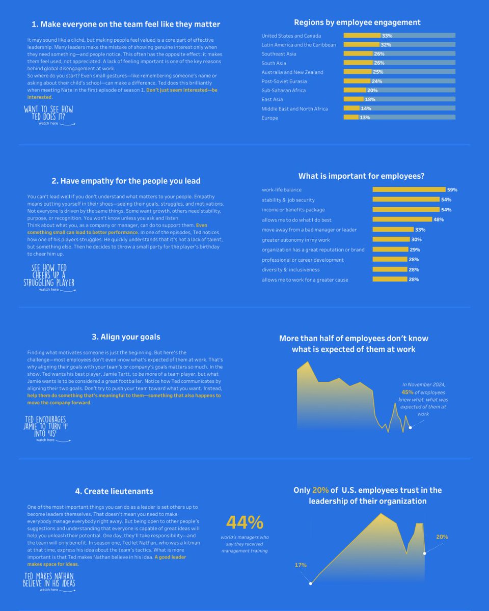
Discover leadership insights through data with this #VizOfTheDay by Vlad Horbachenko, featuring bar charts and area charts to visualize lessons from a hit TV show. tabsoft.co/4kvuDtq

Discover leadership insights through data with this #VizOfTheDay by Vlad Horbachenko, featuring bar charts and area charts to visualize lessons from a hit TV show. 

tabsoft.co/4kvuDtq
Tableau Public (@tableaupublic) 's Twitter Profile Photo

Explore this #VizOfTheDay by Tanya Lomskaya which uses a tile map, Sankey chart, and more to visualize the global aging society. Viz inspired by Klaus Schulte and Will Sutton. tabsoft.co/3UcpOdG

Explore this #VizOfTheDay by <a href="/ta___kaya/">Tanya Lomskaya</a> which uses a tile map, Sankey chart, and more to visualize the global aging society.

Viz inspired by <a href="/ProfDrKSchulte/">Klaus Schulte</a> and <a href="/WJSutton12/">Will Sutton</a>. 

 tabsoft.co/3UcpOdG
Tableau Public (@tableaupublic) 's Twitter Profile Photo

This #VizOfTheDay by Rosh visualizes tricks, tips, and techniques in Tableau shared by Tableau Visionaries Ken Flerlage and Kevin Flerlage at #TC25. Learn how to offset bar chart labels, control subtotals, remove the ‘abc’, and more. tabsoft.co/4kXPaHv

This #VizOfTheDay by <a href="/rosh_data/">Rosh</a> visualizes tricks, tips, and techniques in Tableau shared by Tableau Visionaries <a href="/flerlagekr/">Ken Flerlage</a> and <a href="/FlerlageKev/">Kevin Flerlage</a> at #TC25. 

Learn how to offset bar chart labels, control subtotals, remove the ‘abc’, and more. tabsoft.co/4kXPaHv
Tableau Public (@tableaupublic) 's Twitter Profile Photo

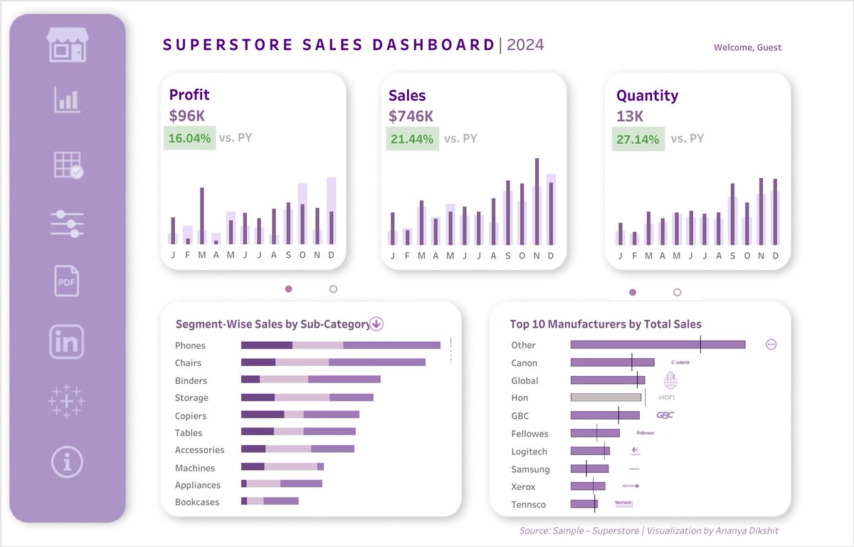
This #VizOfTheDay by Ananya D. visualizes the Superstore dataset with bullet graphs, stacked bar charts, custom tables, and more. Explore the viz: tabsoft.co/40ZhBNN

This #VizOfTheDay by Ananya D. visualizes the Superstore dataset with bullet graphs, stacked bar charts, custom tables, and more. 

Explore the viz: tabsoft.co/40ZhBNN
Tableau Public (@tableaupublic) 's Twitter Profile Photo

This #VizOfTheDay by Bo McCready visualizes with curved timelines the 2024 season across different sport leagues. Explore this #SportVizSunday inspired by Chris Westlake. tabsoft.co/4lCqjKm

This #VizOfTheDay by <a href="/boknowsdata/">Bo McCready</a> visualizes with curved timelines the 2024 season across different sport leagues. 

Explore this #SportVizSunday inspired by <a href="/Westlake_CJW/">Chris Westlake</a>. 

tabsoft.co/4lCqjKm
Tableau Public (@tableaupublic) 's Twitter Profile Photo

Explore this #VizOfTheDay by Hideaki Yamamoto / Chasoso. Using a scatter plot, area graph, and more, this #DataPlusMovies entry visualizes movies with a robot plot and dives into the the film with the highest IMDb score. tabsoft.co/44F0J1j

Explore this #VizOfTheDay by <a href="/_Chasoso/">Hideaki Yamamoto / Chasoso</a>. Using a scatter plot, area graph, and more, this #DataPlusMovies entry visualizes movies with a robot plot and dives into the the film with the highest IMDb score. 

tabsoft.co/44F0J1j
Tableau Public (@tableaupublic) 's Twitter Profile Photo

Explore this #VizOfTheDay by おつう, featuring spatial functions and map layers to visualize the risk of potential asteroid impacts on Earth. tabsoft.co/453HOfx

Explore this #VizOfTheDay by <a href="/tsu_chaan/">おつう</a>, featuring spatial functions and map layers to visualize the risk of potential asteroid impacts on Earth.  

tabsoft.co/453HOfx
Tableau Public (@tableaupublic) 's Twitter Profile Photo

This #VizOfTheDay by John Johansson visualizes common chart types including KPIs, bars, percentage charts, and more. Explore the catalog: tabsoft.co/4kT5mcT

This #VizOfTheDay by <a href="/JohnSJohansson/">John Johansson</a> visualizes common chart types including KPIs, bars, percentage charts, and more. 

Explore the catalog: tabsoft.co/4kT5mcT
Tableau Public (@tableaupublic) 's Twitter Profile Photo

This #VizOfTheDay by Waqar Ahmed Shaikh uses bar charts, KPIs, and tooltips to visualize utility expenses optimized for both desktop and mobile. Explore this business dashboard: tabsoft.co/4mdj8bw

This #VizOfTheDay by <a href="/waqarshaikh86/">Waqar Ahmed Shaikh</a> uses bar charts, KPIs, and tooltips to visualize utility expenses optimized for both desktop and mobile. 

Explore this business dashboard: tabsoft.co/4mdj8bw