typofonderie.com (@typofonderie) 's Twitter Profile
typofonderie.com

@typofonderie

Join graphic designers, art directors, web designers who use our fonts! Buy the best quality typefaces you need. Est. 1994. Visit @typeparis @zecraft

ID: 58196768

linkhttps://typofonderie.com/links calendar_today19-07-2009 13:32:18

17,17K Tweet

11,11K Followers

611 Following

typofonderie.com (@typofonderie) 's Twitter Profile Photo

Aukio by Léo Guibert is a high-contrast display typeface with details inspired by the calligraphic practice of the Nordic countries. ➽ typofonderie.com/fonts/aukio

Aukio by Léo Guibert is a high-contrast display typeface with details inspired by the calligraphic practice of the Nordic countries.
➽ typofonderie.com/fonts/aukio
typofonderie.com (@typofonderie) 's Twitter Profile Photo

Alyssa by Mark De Winne ➽ typofonderie.com/fonts/alyssa Alyssa is a dynamic single weight display typeface that brings flair and sophistication to any project, whether it’s a striking logotype, a vibrant magazine spread, or refined branding.

Alyssa by Mark De Winne
➽ typofonderie.com/fonts/alyssa

Alyssa is a dynamic single weight display typeface that brings flair and sophistication to any project, whether it’s a striking logotype, a vibrant magazine spread, or refined branding.
typofonderie.com (@typofonderie) 's Twitter Profile Photo

🇪🇺🇺🇦🇫🇷 Peace and security meeting for Ukraine. 🕊️There are those times when we can be proud and impressed to see our Aiglon and PS Fournier typefaces used for a just cause.

🇪🇺🇺🇦🇫🇷
Peace and security meeting for Ukraine.

🕊️There are those times when we can be proud and impressed to see our Aiglon and PS Fournier typefaces used for a just cause.
typofonderie.com (@typofonderie) 's Twitter Profile Photo

Altesse is available in five different optical sizes for use in large and smaller sizes, with thirty-eight OpenType functions and 1557 glyphs, the possibilities are infinite or almost!

Altesse is available in five different optical sizes for use in large and smaller sizes, with thirty-eight OpenType functions and 1557 glyphs, the possibilities are infinite or almost!
typofonderie.com (@typofonderie) 's Twitter Profile Photo

Alembert by Jean François Porchez ➽ typofonderie.com/fonts/alembert Alembert draws its influence from the work of the Maîtres écrivains (master writers) of 17th and 18th century France, particularly the Bâtardes and Coulées script models.

Alembert by Jean François Porchez
➽ typofonderie.com/fonts/alembert

Alembert draws its influence from the work of the Maîtres écrivains (master writers) of 17th and 18th century France, particularly the Bâtardes and Coulées script models.
typofonderie.com (@typofonderie) 's Twitter Profile Photo

Typographical note: Donald Trump uses Optima to set his graph about tariffs. Germany is a target for its automotive industry. Does he know that Optima was designed by the German type designer Hermann Zapf? The shape and content of his message doesn't match very well.

Typographical note: Donald Trump uses Optima to set his graph about tariffs. Germany is a target for its automotive industry. Does he know that Optima was designed by the German type designer Hermann Zapf?

The shape and content of his message doesn't match very well.
TypeParis Now25 Graphic & Type Conference (@typeparis) 's Twitter Profile Photo

Register now to the Workshop Nº 23 Letterpress at Salt & Cedar on 1 June 2025 conducted by salt & cedar typeparis.com/courses/worksh… 🎯 Save €40 on the group purchase with #typeparisnow25 regular ticket using coupon LETTERPRESSNOW25
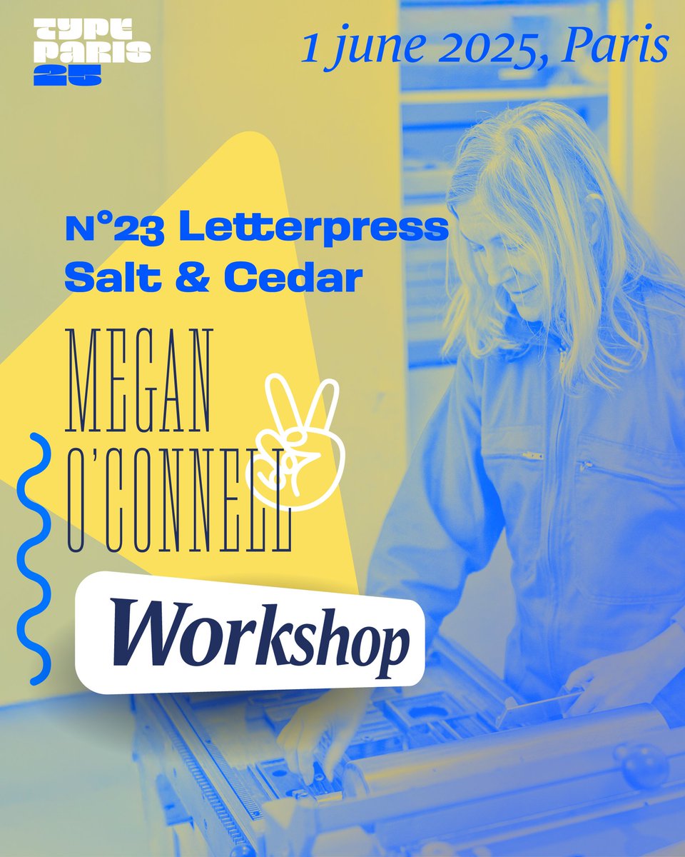
Register now to the Workshop Nº 23 Letterpress at Salt &amp; Cedar on 1 June 2025 conducted by <a href="/saltandcedar/">salt & cedar</a> typeparis.com/courses/worksh…

🎯 Save €40 on the group purchase with #typeparisnow25 regular ticket using coupon LETTERPRESSNOW25
typofonderie.com (@typofonderie) 's Twitter Profile Photo

Do you know the various g, y, k, s (…) available in Ambroise? The difference with other Didot is that it is designed “compactly;” it is not an enlarged text typeface, it is immediately imagined for large size uses. ➽ typofonderie.com/fonts/ambroise

Do you know the various g, y, k, s (…) available in Ambroise? The difference with other Didot is that it is designed “compactly;” it is not an enlarged text typeface, it is immediately imagined for large size uses.

➽ typofonderie.com/fonts/ambroise
typofonderie.com (@typofonderie) 's Twitter Profile Photo

Atipo choose to set the Colono Gourmet logo in Retiro! “The logo is composed with the Retiro typeface, elegant didona of Spanish airs that perfectly communicates the origin and the select character of the products.” ➽ typofonderie.com/fonts-in-use/c…

Atipo choose to set the Colono Gourmet logo in Retiro!
“The logo is composed with the Retiro typeface, elegant didona of Spanish airs that perfectly communicates the origin and the select character of the products.”
➽ typofonderie.com/fonts-in-use/c…
TypeParis Now25 Graphic & Type Conference (@typeparis) 's Twitter Profile Photo

#typeparisnow25 31 May 2025, Paris. 🛎 Regular tickets €170. Include access to all talks, tote bag full of graphic+type goodies. Anni Seligmann, Tyrsa, Ariane Spanier, Mathilde Vallée, Tina Touli, Rachel Joy Price, Lucas Sharp, Veronika Burian, Mathieu Réguer, Joachim Roncin.

#typeparisnow25 31 May 2025, Paris. 
🛎 Regular tickets €170. Include access to all talks, tote bag full of graphic+type goodies. Anni Seligmann, Tyrsa, Ariane Spanier, Mathilde Vallée, Tina Touli, Rachel Joy Price, Lucas Sharp, Veronika Burian, Mathieu Réguer, Joachim Roncin.
typofonderie.com (@typofonderie) 's Twitter Profile Photo

Master piece by Louis Barbedor. One of the major influence of Alembert. Read about it on details page: ➽ typofonderie.com/fonts/alembert…

Master piece by Louis Barbedor. One of the major influence of Alembert. Read about it on details page:

➽ typofonderie.com/fonts/alembert…
typofonderie.com (@typofonderie) 's Twitter Profile Photo

Honored to see our Arsen typeface displayed at the Tokyo TDC Exhibition 2025, Ginza Graphic Gallery (ggg) in Tokyo. ➽ typofonderie.com/fonts/arsen-af… From the 3590 entries to the TDC Tokyo 2025 competition, the jury honored 486 works for the yearbook, 11 award winners, and 52 awards.

Honored to see our Arsen typeface displayed at the Tokyo TDC Exhibition 2025, Ginza Graphic Gallery (ggg) in Tokyo. 
➽ typofonderie.com/fonts/arsen-af…

From the 3590 entries to the TDC Tokyo 2025 competition, the jury honored 486 works for the yearbook, 11 award winners, and 52 awards.
typofonderie.com (@typofonderie) 's Twitter Profile Photo

Read about Romain du Roi. The first bespoke typeface of history created for Louis XIV, which marks the beginnings of a new typography era. ➽ typofonderie.com/gazette/le-rom… By Michel Wlassikoff, French historian.

Read about Romain du Roi. The first bespoke typeface of history created for Louis XIV, which marks the beginnings of a new typography era.
➽ typofonderie.com/gazette/le-rom…
By Michel Wlassikoff, French historian.
typofonderie.com (@typofonderie) 's Twitter Profile Photo

The two most extreme Austerlitz ampersands (Petit Black + Affiche Light) that manage to align, while being totally different, summarize type design obsession for an invisible perfection that no one cares about. ➽ typofonderie.com/fonts/austerli…

The two most extreme Austerlitz ampersands (Petit Black + Affiche Light) that manage to align, while being totally different, summarize type design obsession for an invisible perfection that no one cares about.
➽ typofonderie.com/fonts/austerli…
typofonderie.com (@typofonderie) 's Twitter Profile Photo

To remind those who talk about kerning instead of spacing. 1. Kerning refers to the adjustment of space between individual pairs of letters made by type designers. Such between A and T 2. Spacing refer to the overall space in a group of letters, words, sentences.